What is Reponsive Web Design?
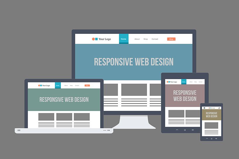
Responsive Web design is an approach whereby a designer creates a Web page that “responds to” or resizes itself depending on the type of device it is being seen through. That could be an oversized desktop computer monitor, a laptop, a 10-inch tablet, a 7-inch tablet, or a 4-inch smartphone screen.
Responsive Web design has become one of the hottest trends in 2013. This is due in part to the growth of smartphones and other mobile devices. More people are using smaller-screen devices to view Web pages.
In fact, Mashable even dubbed 2013 the Year of Responsive Web Design. Pete Cashmore wrote, ”For those of us who create websites and services, all this leads to a singular conclusion: A million screens have bloomed, and we need to build for all of them.”
Let’s just get right into it: Believe it or not, the Advent Design site that you’re reading this article on is actually a responsive design! To see it in action, open this article on a desktop browser and slowly make the browser thinner and wider. You should see the layout magically adjust itself to more comfortably fit the new width of the browser, even if you make the page as skinny as the resolution of a mobile phone. Here are some screenshots of what the Think Vitamin design looks like at various screen resolutions:


It’s hard to talk about responsive design without mentioning its creator, Ethan Marcotte. If you haven’t read his seminal article about responsive web design, I highly recommend you check it out (seriously, this is required reading). In the article, Ethan discusses all the key ideas that form responsive web design; and that’s really what responsive design is, technically. It’s not a single piece of technology, but rather, a set of techniques and ideas that form a whole. This is one of the main sources of confusion, and in a moment we’ll break things down and take a look at each part.
So, what is responsive design exactly? Actually, a better question to ask might be, what problem does responsive web design solve? Well, as you may have noticed, computers aren’t the only piece of hardware with a web browser anymore. I might get myself in trouble by saying this, but the iPhone was one of the first mobile devices to feature a really great web browser, and it really put the spotlight on upgrading the experience of the mobile web. Many other devices followed suit and, seemingly overnight, the face of the mobile web had changed.
The changing landscape of web browsers meant that users expectations also changed; people expected to be able to browse the web on their phones just as easily as they browse the web on a desktop computer. So, in response to this (if you’ll excuse the pun) the web design community started creating mobile versions of their websites. In hindsight, this wasn’t really the way forward, but at the time it seemed like a reasonable idea. Every website would have their normal ‘desktop’ version of their site, and as a bonus, a ‘mobile’ version.
Technology never stops marching forward, so not long after the phone hardware market had been revolutionized, other form factors surged in popularity. In addition to phones and personal computers, devices like touchscreen tablets and small notebook computers (netbooks, if you prefer the term) started appearing everywhere.
It’s not just small screens, either. Large, high-resolution displays are starting to become much more common than they used to be, and it would be a waste for web designers to not take advantage of this.
In summary, the spectrum of screen sizes and resolutions is widening every day, and creating a different version of a website that targets each individual device is not a practical way forward. This is the problem that responsive web design addresses head on.
Until next time,
Tags: Responsive Design, Mobile


